Ecomonic indicators between the years of 2008- 2013
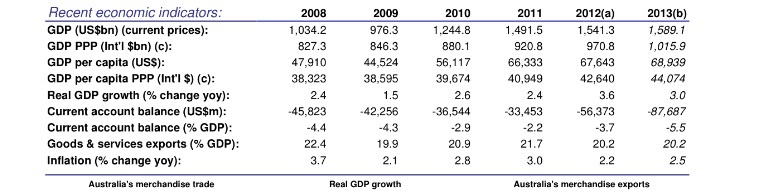
This table shows general information based on Australia's economy The table shows increases and decreases in each of the nine categories displayed throughout different time periods. An example of this from the graph is inflation (% change yoy). In 2008; inflation was up to 3.7 percent ; but, as time has progressed ; the inflation has dropped to 2.5 percent in the year of 2013.
This graph is accurate and provides recent and the latest figures in relation to different categories within the Australian economy.
This graph is accurate and provides recent and the latest figures in relation to different categories within the Australian economy.
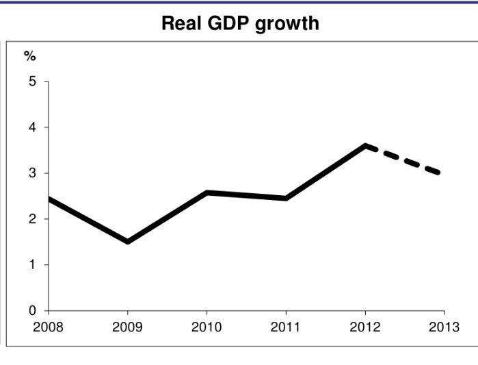
This graph displays and shows a visual representation of the movements and changes with real GDP growth during the years of 2008 to 2013. The graph shows the increases and decreases throughout the time periods presented in the graph ; in terms of GDP growth.
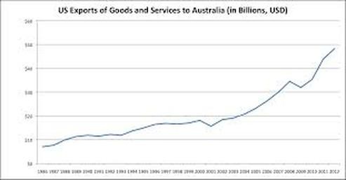
This graph displays the US exports of goods and services to Australia. From the information given on the graph; it is clear that over time ; exports have increased overtime and reached its peak in the year of 2012. There are noticeable increases of exports within the graph ;especially towards the 2000's
( towards end of graph ) .
( towards end of graph ) .
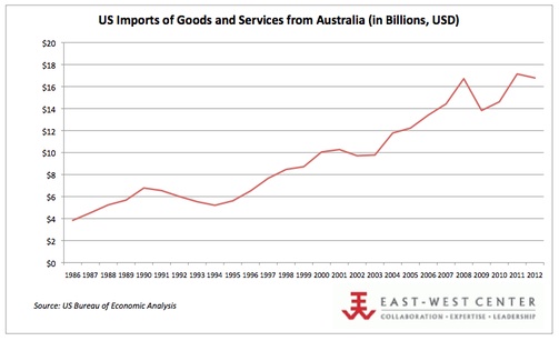
This graph shows the United States imports of goods and services from Australia in billions (USD). From the graph; you can see that during the years of 1992 to 1994 there is a drop in imports; but over time ; the imports increased and reached a peck during the year of 2008. In the year 2012 ; the imports dropped ; but not dramatically.
